Tap-to-call on every screen
Your number sits at the top of every page and dials with one tap. A patient in pain will not hunt for a contact form.
When a tooth aches at midnight, nobody browses. They search for a dentist, they check the reviews, they book. We build fast, mobile-first websites for dentists that turn that moment into your booked appointment, and that sell the big planned treatments just as well.
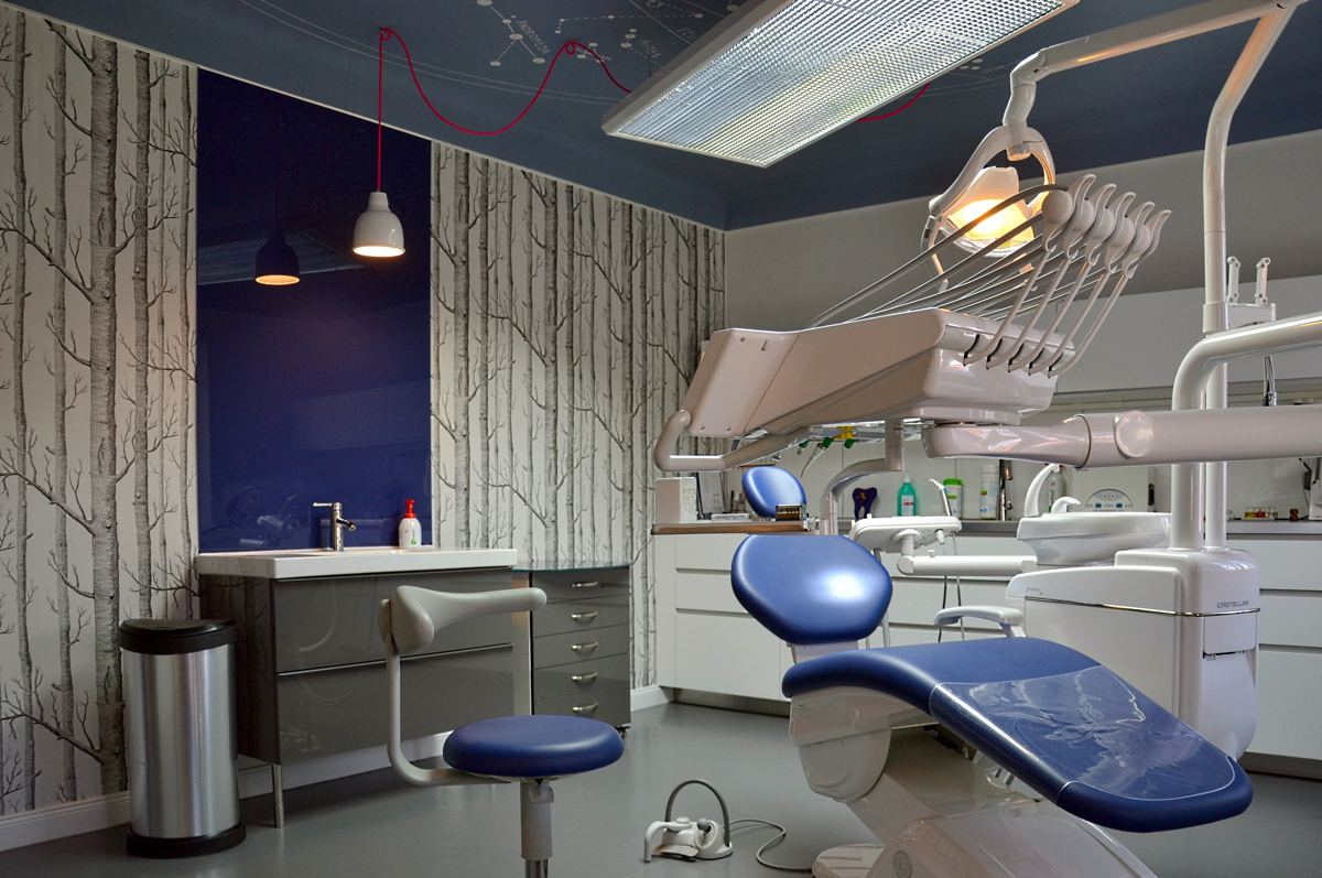
Photo: AAABBC, Wikimedia Commons, CC BY-SA 3.0
A tooth cracks on a Saturday night. A filling comes loose before a holiday. The patient pulls out their phone, searches, and opens the first three practices that look like they can help. The winner is the one where they can see a phone number in two seconds and tap to call, or a book button they can press without calling at all. If your site loads slowly, hides your number, or looks like it was built in 2015, you never get the booking. The patient goes to whoever looked easiest to reach.
Your number sits at the top of every page and dials with one tap. A patient in pain will not hunt for a contact form.
The urgent work gets its own space on the homepage, not a line buried halfway down a services list.
Checkups and hygiene, whitening, straightening, implants, dentures and emergency appointments. Each one gets its own page, so patients land on the exact treatment they need.
Patients search for a dentist in their own area. Your site says, in plain words, that you practise where they live, town by town.
Your Google reviews sit next to the call button, because a stranger's five stars are what turn a tap into a booking.
No heavy sliders, no stock-photo carousels. The site loads in seconds on a phone, which is where almost every toothache search starts.
Patients can tell a stock photo from a real practice. We build your gallery from photos of your own rooms and team, even phone photos, and make them look sharp on the page.
Next to the call button sits online booking, so the patient comparing practices at midnight can still book. The booking lands with your reception team, ready for the morning.
Most calls come in while the phone is busy and nobody can pick up. Next to the call button, your site gives patients a second way in: a simple form for the visit details, or an online booking slot. The enquiry waits in your inbox for when the phone is free.
Dental work is local work, and the site is written for the places you actually cover. We build for dentists across the UK, Canada, the US and Australia, with the areas you serve named plainly on the page and the treatments your patients actually ask about: checkups and hygiene, whitening, straightening, implants and emergency appointments, written in the words your market uses.
Already have a trade page with us? Your dental page links to them, and they link back, so a patient who finds either one finds the other. See our website design for electricians and website design for roofers pages.
A patient with a toothache and a patient planning implants are not the same visitor, and they should not meet the same button. One needs a phone number in two seconds. The other wants to read, compare, and book when they are ready. A site that forces both through one contact form loses the first and rushes the second.
A cracked tooth, a lost filling, pain that will not wait. The top of the page gives them one big tap-to-call button and your areas, so the call starts before they have read a paragraph. No form in the way, no menu to hunt through.
Whitening before a wedding, straightening, implants, a new patient checkup. These patients compare two or three practices, read the treatment page, and check your reviews. They get a simple booking form for the treatment and the time that suits them, and the booking waits with your reception team.
A patient searching for teeth whitening and a patient searching for dental implants are not typing the same search, so they should not land on the same page. One long services list ranks for neither. Each treatment you want more of gets its own page, written in plain words, with its own headline, its own photos, and its own questions answered: checkups and hygiene, teeth whitening, straightening, dental implants, dentures and emergency appointments. When the page matches the search, the patient stops comparing and starts booking.
Same process we run for every trade, tuned for dental work. The full breakdown is on the homepage; the short version is below.
We record a short video of what is holding your current site back and what we would change. Free, no pitch inside.
We write the copy from your services and areas, build the site, and send you a live draft to click through.
Up to three revision rounds. You do not pay the flat fee until you love the draft. Then it goes live.
A complete rebuild for $499, shown in dollars on the pricing page. No hourly billing, no surprise invoices. See the full pricing and what the care plan covers.
One flat fee: $499, shown in dollars on our pricing page. No hourly billing, no surprise invoices, and you do not pay until you love the draft.
Seven days from the day we start. You review the draft, we do up to three revision rounds, and it goes live when you are happy.
No. We write the copy from your services, your materials, and the areas you cover. You read it over and tell us where it does not sound like you.
That is the point. Your phone number is tap-to-call on every screen, and toothache and emergency appointments are given real prominence instead of being buried in a services list.
Yes. You approve the draft first. If you do not love it, you do not pay. That is the whole arrangement.
That is the preference. Real photos of your practice and your team build trust faster than any sales copy. Send phone photos of the rooms and the team and we will make them look sharp on the page.
The treatments you want more of, yes. A checkups page, a whitening page, and an implants page each match the exact search a patient typed, so Google has something clear to show and the patient finds their answer in seconds. A single services list ranks for none of them, and it makes every visitor dig for what they need.
Yes. Your site can offer online booking next to the call button, so the patient who is comparing practices at midnight can still book. The booking lands with your reception team, ready for the morning.
Yes. A missed call usually becomes someone else's patient. Your site gives the patient a second way in: a simple form for the visit details, or an online booking slot. The enquiry waits in your inbox for when the phone is free.
Yes, but only if the two routes stay separate. Toothache and emergency work get the tap-to-call button first, planned treatments get the treatment page and the booking form. One button for both means the toothache patient fills in a form while in pain, and the implants patient gets rushed into a call they did not want.
Send us your current site and we will record a free 2-minute video audit: what is holding it back and exactly what we would change.
Get a free site auditPrefer reading first? How to get your business found on Google.